When you're aiming to create a high-converting landing page, it's essential to focus on elements that truly resonate with your audience. Start by crafting compelling headlines; they should capture attention instantly and convey your message clearly. Don't underestimate the power of a well-placed call-to-action; it can guide your visitors effortlessly toward the next step. The visual appeal of your page, from design to imagery, plays a critical role in keeping visitors engaged. But what about A/B testing and its impact on conversions? There's much more to explore about these strategies.
Craft Compelling Headlines
Crafting compelling headlines is a critical component of any high-converting landing page, as studies show that 80% of visitors will read a headline, but only 20% will read the rest of the content. This statistic underscores the importance of a headline's ability to capture attention quickly and effectively.
To create a headline that resonates, you need to focus on clarity, relevance, and urgency.
Firstly, clarity is non-negotiable. Your headline should communicate the value proposition succinctly. Data from marketing research suggests that headlines with 6-12 words achieve the highest engagement. Aim for a balance that provides enough information to entice readers without overwhelming them.
Relevance is equally crucial. Tailor your headline to address the specific needs and pain points of your target audience. Analyzing customer data can help you identify these key areas. For example, knowing that 65% of your audience prioritizes cost-effectiveness allows you to craft headlines that emphasize savings or discounts.
Lastly, urgency drives action. Incorporate time-sensitive language to encourage immediate responses. Phrases like "limited time offer" or "act now" can increase click-through rates by up to 20%, according to conversion studies. However, it's essential to maintain honesty and authenticity to build trust.
Use A/B testing to refine your headlines over time. By analyzing performance metrics, you can identify which headlines yield the highest conversion rates.
Optimize Call-to-Actions
When it comes to optimizing call-to-actions (CTAs), you're essentially guiding your visitors toward taking a specific, desired action on your landing page. Data shows that a well-optimized CTA can increase conversion rates by up to 232%. So, it's crucial to focus on clarity, urgency, and value to drive engagement.
Start by ensuring your CTA is concise yet powerful. Studies reveal that CTAs with strong verbs like "Download," "Join," or "Get Started" can boost click-through rates by 13%. Avoid generic phrases like "Submit" or "Click Here," as they lack persuasive power. Instead, tailor your message to the user's intent, making the benefit clear and immediate.
Placement and color also play vital roles. Analytics indicate that placing the CTA above the fold can result in a 20% higher conversion rate. Furthermore, using contrasting colors that stand out from the rest of the page can enhance visibility by 45%. It's not just about grabbing attention; it's about directing focus where it matters most.
Additionally, consider A/B testing your CTAs. This analytical approach allows you to compare different versions and determine which performs best. Data from various studies suggest that A/B testing can lead to a 30% improvement in conversion rates.
Use metrics like click-through rates and bounce rates to make informed decisions.
Enhance Visual Appeal
A visually appealing landing page can significantly impact your conversion rates, and data backs this up. Studies reveal that first impressions are formed in just 50 milliseconds, emphasizing the importance of an aesthetically pleasing design. A well-designed page can increase your credibility and make users more likely to engage. To harness this potential, focus on elements like color schemes, typography, and imagery.
Color psychology plays a crucial role in influencing emotions and actions. Research indicates that adjusting your color palette can boost brand recognition by up to 80%. Choose colors that align with your brand identity and evoke the desired emotional response. For example, blue often conveys trust and stability, while orange can incite excitement and enthusiasm.
Typography is another critical component. It should be both readable and consistent with your brand's voice. Studies show that 94% of first impressions are related to design elements, and legible fonts contribute significantly. Opt for clean, modern fonts that enhance readability and ensure your message is clearly conveyed.
Imagery should complement your content and resonate with your audience. High-quality visuals can increase willingness to engage by 80%. Use relevant images that support your message and keep file sizes optimized to avoid slow loading times, which can reduce conversions by up to 7%.
Incorporating these design principles strategically can enhance your landing page's visual appeal. By aligning design elements with user psychology, you create an inviting and trustworthy environment that encourages conversions.
Streamline Navigation
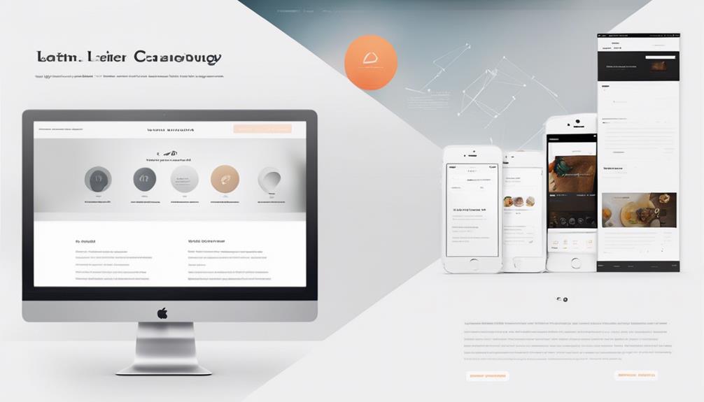
Seamless navigation is the backbone of a high-converting landing page. With 94% of first impressions related to design, ensuring your visitors can easily find their way around is crucial. Streamlined navigation minimizes bounce rates and enhances user satisfaction, which directly impacts your conversion rates. Data shows that 88% of online consumers are less likely to return to a site after a bad experience. Therefore, your navigation must be intuitive and user-centric.
Start by eliminating unnecessary navigation elements. A study by the Nielsen Norman Group found that users often struggle with overloaded navigation menus, leading to a frustrating experience. Instead, focus on a clean, minimalistic menu that directs users efficiently toward your call-to-action.
Consider the principle of Hick's Law, which suggests the more choices you present, the longer it takes for a user to make a decision. Simplifying options can reduce cognitive load and guide users swiftly to desired actions.
Utilize visual hierarchy effectively. Ensure that key elements, like your CTA, stand out. Eye-tracking studies indicate that users primarily follow an F-pattern when scanning web pages. Place important links and buttons along these natural paths to maximize visibility and engagement.
Furthermore, employ consistent labeling and structure. Consistency breeds familiarity, which can increase user comfort and confidence in navigating your site. According to HubSpot, consistent navigation can improve user retention by 50%.
Incorporate responsive design to maintain seamless navigation across all devices. With mobile devices accounting for over half of web traffic, ensuring a smooth experience on smaller screens is non-negotiable.
Implement A/B Testing
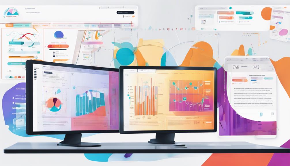
With the power of A/B testing in your toolkit, you can confidently refine your landing page for maximum conversion. By comparing two versions of a page—Version A and Version B—you'll gather quantifiable data about which elements drive user engagement and conversions. This method is invaluable because it removes guesswork, allowing decisions rooted in actual user behavior rather than assumptions.
Start by identifying key elements to test: headlines, call-to-action (CTA) buttons, images, or even color schemes. For instance, changing a CTA button's color from blue to orange might increase click-through rates by 25%, as some studies suggest.
But don't stop there; test headlines, which can impact conversion rates by as much as 127%, according to industry data.
When implementing A/B testing, ensure you have a statistically significant sample size to avoid skewed results. Tools like Google Optimize or Optimizely can assist you in setting up and analyzing tests efficiently.
Remember, only test one variable at a time to isolate its impact on user behavior.
Analyze your results with precision. If Version B outperforms Version A, delve into why that might be. Perhaps the new headline resonates better with your target audience, or the simplified layout reduces friction. Use these insights to iterate and improve continuously.
A/B testing isn't a one-time task but a perpetual process. By regularly testing and refining, you ensure your landing pages remain optimized for the ever-changing preferences of your audience.
Data-driven decisions will lead to higher conversion rates, ensuring your landing page's success.
Conclusion
As you embark on your quest for conversion greatness, remember the wisdom of the ancients: a powerful headline is your siren's call, luring visitors into a seamless journey. Your CTAs are the decisive strokes of a maestro, guiding action with precision. Visuals should be as captivating as a masterpiece, while streamlined navigation ensures a path as clear as a well-trodden trail. Embrace A/B testing as your oracle, revealing insights that transform the ordinary into the extraordinary.
