When you're looking to enhance your e-commerce site, optimizing navigation is a crucial step that shouldn't be overlooked. A streamlined menu structure and the use of clear categories can significantly improve user experience, guiding your customers effortlessly to what they need. But that's just the beginning. How do you ensure users stay engaged and find exactly what they're searching for, even on mobile devices? And what about the role of internal linking and search functionality in boosting conversions? Let's explore these strategies further and uncover the nuances of effective e-commerce navigation.
Simplify Your Menu Structure
When it comes to enhancing user experience on your e-commerce site, simplifying your menu structure should be at the top of your priority list. A streamlined menu ensures your visitors find what they need quickly, leading to higher satisfaction and increased conversions.
Start by reducing clutter. An overcrowded menu can overwhelm users, making navigation a daunting task. Instead, focus on the essentials—those categories and items that truly matter to your audience.
Consider the way users interact with your site. They're usually on a mission, seeking specific products or information. A clean, straightforward menu helps them achieve their goals without frustration. Group related items together logically, minimizing the depth of your menu. This avoids the need for excessive clicks and keeps users engaged.
Make it intuitive. If users can predict where to find something, they'll have a smoother experience. Use familiar terms and avoid jargon that might confuse new visitors. Consistency is key—use the same labels and arrangements across all pages to prevent disorientation.
Don't forget mobile users. A responsive design is crucial since more people shop on their phones. Ensure your menu adapts seamlessly to smaller screens, presenting the most critical options upfront. A collapsible menu can be your best friend here, offering a neat, organized look.
Lastly, test your menu structure. Gather feedback from real users and analyze navigation data. Adjust based on insights to continually refine the experience.
Implement Clear Categories

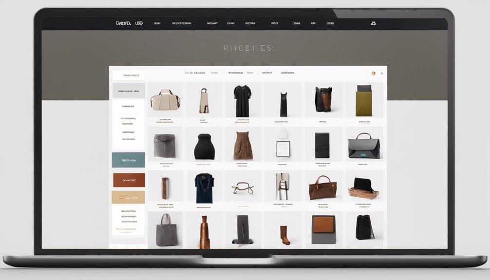
After streamlining your menu structure, it's important to focus on implementing clear categories. Your e-commerce site should guide users effortlessly to the products they desire. Start by grouping similar items into logical, intuitive categories.
Think about how a customer shops: they don't want to sift through unrelated items. By organizing products into clear, concise categories, you enhance user experience and reduce frustration.
Next, use language that resonates with your audience. Avoid industry jargon that might confuse the average shopper. Instead, use straightforward, descriptive terms that align with what your customers are likely searching for. For example, instead of "Apparel," consider "Men's Clothing" or "Women's Shoes" for specificity.
Consider your category hierarchy carefully. Aim for a balance between broad and specific categories to prevent overwhelming users with too many options while still offering detailed paths when necessary.
Too broad, and users might get lost; too narrow, and navigation becomes cumbersome.
Regularly review your categories. As trends change and your product catalog grows, you might need to adapt your categories to better serve your customers.
Ensure that any new categories follow the same intuitive logic as the existing structure.
Utilize Breadcrumbs Effectively

Use breadcrumbs to make your site navigation seamless and intuitive.
They help users understand where they're on your site and how they got there, enhancing their overall experience.
Enhance User Experience
Navigating an e-commerce site becomes a breeze when you effectively employ breadcrumbs to enhance user experience. Breadcrumbs offer a visual trail for users, making it easy to trace their steps back without frustration. With the right setup, you can guide your visitors through your site effortlessly, reducing bounce rates and improving engagement.
Consider these breadcrumb types:
| Type | Description |
|---|---|
| Location-Based | Shows the user's path within the site, reflecting the site's structure. |
| Attribute-Based | Displays attributes of the current page, useful for product specifications. |
| Path-Based | Tracks the actual path the user has taken, great for dynamic browsing. |
| Hybrid | Combines elements from different breadcrumb types for comprehensive trails. |
When you select the appropriate breadcrumb type, you're not just simplifying navigation; you're also boosting the overall user experience. Users appreciate being able to see where they are and how they got there. It's like giving them a map that updates with every click.
Improve Page Hierarchy
A well-structured page hierarchy is crucial for intuitive e-commerce site navigation, and breadcrumbs play a pivotal role in achieving this. They guide users through your site, showing them where they are, where they've been, and how to get back. By implementing breadcrumbs, you help users navigate your site efficiently, reducing frustration and enhancing their overall experience.
To utilize breadcrumbs effectively, keep them straightforward and consistent. Start by displaying the path from the homepage to the current page. This gives users a clear picture of their location. Use simple, descriptive labels for each breadcrumb; avoid jargon or overly technical terms that might confuse users.
Ensure breadcrumbs are clickable, allowing users to backtrack easily without having to rely on the back button or search bar.
Integrating breadcrumbs also improves your site's SEO. Search engines like Google use breadcrumbs to understand your site's structure, which can help enhance your site's visibility in search results. Make sure to use structured data markup for breadcrumbs to maximize this benefit.
Enhance Internal Linking

Boosting your e-commerce site's internal linking can significantly enhance user experience and improve search engine visibility. By interconnecting your pages effectively, you guide users through your site, making it easier for them to find what they're looking for. This seamless navigation encourages longer visits, reduces bounce rates, and ultimately leads to higher conversions.
Start by mapping out a logical structure for your internal links. Link related products, categories, and informational pages. For instance, if a customer is browsing a specific product, consider linking to complementary items or relevant blog posts. This not only aids users in exploring but also showcases the breadth of your offerings.
Utilize anchor text wisely. Use descriptive, keyword-rich anchor text that clearly indicates what users will find when they click. This helps in both user clarity and search engine understanding, improving your site's SEO.
Don't overlook your site's footer and sidebar. These areas are perfect for including links to important pages like return policies, support, and top-selling products. They remain visible across your site, providing quick access to critical information.
Regularly audit your links to ensure they remain relevant and functional. Broken links can frustrate users and harm your site's credibility. Use tools like Google Search Console to identify and fix any issues promptly.
Lastly, consider implementing a related products or "Customers Also Viewed" section on product pages. This not only enhances internal linking but also encourages users to explore more, increasing the likelihood of additional purchases.
Optimize Mobile Navigation

To optimize your site's mobile navigation, start by simplifying your menu structure.
Ensure users can easily find what they're looking for without excessive scrolling or clicking.
Enhance touch responsiveness so every tap feels smooth and accurate, providing a seamless experience.
Simplify Menu Structure
Navigating a mobile e-commerce site can often make or break the user experience, so it's crucial to simplify the menu structure. When users visit your site, they should find what they're looking for without getting lost in a maze of options.
Start by minimizing the number of categories in your menu. Keep it streamlined and intuitive; too many choices can overwhelm users and lead to frustration.
Prioritize the most important categories and ensure they're easily accessible. Use clear, concise labels that describe each section accurately. Avoid jargon or complex terms that might confuse users.
If you have subcategories, group them logically under main categories, but limit their number to keep navigation quick and straightforward.
Consider using a hamburger menu icon, which is a familiar tool for mobile users. This saves screen space and keeps the interface clean.
Ensure that the menu is consistently placed in a familiar spot, like the top left or right corner, so users know where to find it.
Enhance Touch Responsiveness
While a simplified menu structure lays the foundation for seamless navigation, ensuring your site responds effectively to touch inputs elevates the mobile user experience. Your goal should be to create a site that's intuitive and efficient, allowing users to navigate with the lightest tap. Start by optimizing touch targets—buttons, links, and icons—to be large enough for fingers, minimizing frustration and misclicks.
Responsive Design Elements | Benefits | Tips
—|—|—
Large Touch Targets | Reduces misclicks | Increase button size
Fast Load Times | Keeps users engaged | Compress images and scripts
Smooth Transitions | Enhances experience | Use CSS for animations
Fast load times are crucial. Nobody wants to wait for a page to load, especially on mobile. Ensure your images and scripts are compressed, and your hosting is up to speed. Smooth transitions between pages and actions improve the overall experience. Using CSS for animations can make your site feel more responsive and engaging without sacrificing speed.
Prioritize Search Functionality

Amidst the myriad features of an e-commerce site, a robust search functionality stands paramount for enhancing user experience. When users land on your site, they often have a specific product in mind. A strong search bar is their gateway to finding it quickly. By prioritizing this feature, you ensure that customers can effortlessly locate exactly what they're looking for, boosting their satisfaction and your sales potential.
Start by placing the search bar prominently on your homepage. It should be easily visible and accessible, preferably at the top, so users don't have to hunt for it. Make sure it's large enough to catch the eye but not so big that it overwhelms the page.
Next, focus on the search mechanics. Incorporate features like autocomplete to guide users as they type. This not only speeds up the search process but also suggests popular products they might be interested in.
Implement filters and sorting options to refine search results further, allowing users to narrow down choices based on price, brand, or other relevant attributes.
Don't forget to optimize your search algorithm. It should accommodate typos, synonyms, and varied search terms to deliver accurate results.
Consider using AI tools that learn from user behavior to improve search accuracy over time.
Use Descriptive Labels

Clear and intuitive site navigation is crucial for a seamless shopping experience, and using descriptive labels can significantly enhance this aspect. When labels are precise, visitors can easily find what they're looking for, reducing frustration and improving the likelihood of a purchase. Imagine browsing a store where every sign is vague or misleading—it's off-putting, right? You want your e-commerce site to be the opposite: welcoming, straightforward, and easy to navigate.
Descriptive labels should accurately reflect the content or action associated with them. For example, instead of a generic "Products" label, use something like "Women's Apparel" or "Tech Gadgets." This specificity helps users quickly locate their interests. Here's a simple guide to help you create effective labels:
| Generic Label | Descriptive Label |
|---|---|
| Products | Kitchen Appliances |
| Services | Home Cleaning |
| Blog | Travel Tips |
| Contact | Get in Touch |
| About | Our Story |
When crafting labels, put yourself in the user's shoes. What terms would make sense to them? How can you convey the destination or content succinctly? Remember, less is more. Avoid jargon or overly clever names that might confuse your audience.
Conclusion
Imagine navigating an e-commerce site as effortlessly as flipping through your favorite book. By simplifying your menu, using clear categories, and adding breadcrumbs, you create a seamless journey for users. Enhance this by boosting internal links and prioritizing mobile navigation—ensuring every click feels intuitive and efficient. Don't forget to make search functionality front and center. With these strategies, you're not just improving navigation; you're crafting an experience that turns browsers into buyers.


